

A living room that feels put-together rarely happens by accident. More often than not, it comes down to a color palette that was chosen with some intention — not just a wall color picked in isolation, but a small set of tones that were designed to work together across the walls, the furniture, the textiles, and the accessories. If you've ever stood in a paint aisle overwhelmed by swatches, or bought a rug you loved that somehow fights with everything else in the room, the good news is that building a palette that works is more formula than talent. Here's how to think it through.
Start With the 60-30-10 Rule
Interior designers have leaned on a simple ratio for decades because it works: 60% of the room in a dominant color, 30% in a secondary color, and 10% in an accent. It's not a rigid law, but it's a genuinely useful starting point when a room feels like it has too much going on, or not enough.
60% — Your Dominant Color
This is usually your walls and your largest pieces of furniture — a sofa or sectional, in many living rooms. Because it covers the most visual area, this is the color that sets the overall mood of the room, so it's worth choosing a tone you're confident you'll still like in five years, not just this season.
30% — Your Secondary Color
This is where a rug, a set of curtains, or an accent chair comes in. It should relate to the dominant color — either a complementary tone or a different shade within the same family — without competing with it for attention.
10% — Your Accent Color
This is the smallest, boldest layer: pillows, art, a vase, a throw blanket. Because it's a small dose, this is exactly where it's safe to be a little more adventurous with color.
Build the Palette Around a Material, Not a Paint Chip
One of the most reliable ways to land on a palette that actually feels cohesive is to start with a material you already love — or already own — instead of starting from a color wheel. A material has depth, undertone, and texture that a flat paint swatch doesn't, and building outward from it tends to produce a room that feels layered rather than matched.
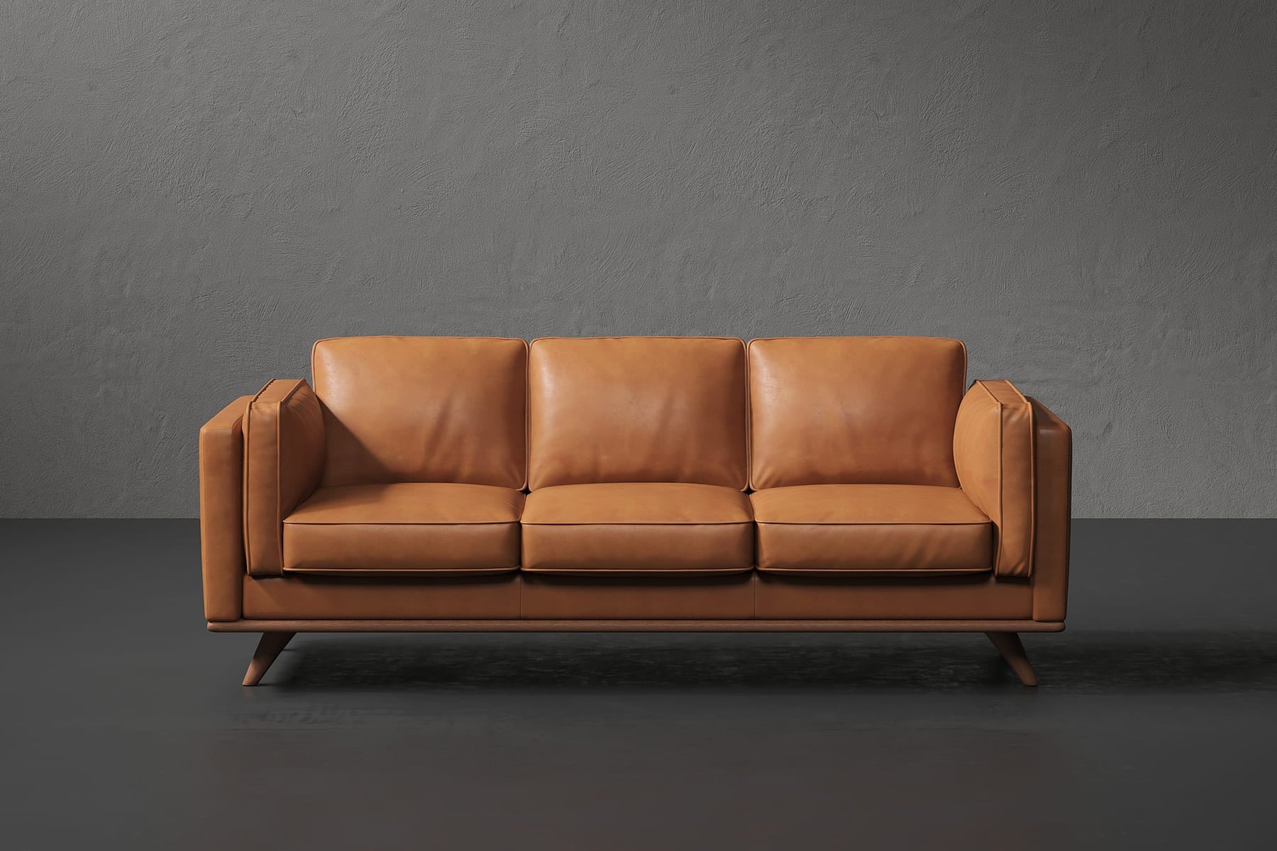
Take a leather sofa in a rich cognac or espresso tone. That leather isn't one flat color — it has warm undertones, natural variation, and a texture that shifts with light. Once that piece is in the room, the rest of the palette can be chosen to complement those warm undertones: soft warm neutrals on the walls, a wool rug in a muted rust or olive, brass or wood accents rather than cool chrome.

Shown: Maestro 3 Seater Leather Sofa
A dramatic material can just as easily anchor a cooler, more graphic palette. A coffee table with bold black marble veining, for instance, pulls the eye toward contrast and clean lines rather than warmth — which suggests a palette of crisp whites, charcoal, and cool greys, with a single deep accent color rather than a warm one.

Shown: Greco Nero Marquina Marble Coffee Table
Warm Neutrals vs. Cool Neutrals — and Which Suits Your Room
Neutrals are rarely truly neutral. Warm neutrals — cream, sand, taupe, warm greige — carry undertones of yellow, orange, or red. Cool neutrals — dove grey, soft white, pale blue-grey — carry undertones of blue or green. Which one will feel right in your room often has less to do with personal preference and more to do with how much natural light the room actually gets.
Rooms with abundant natural light, especially north-facing rooms with a softer, more even light throughout the day, can generally handle cooler tones well — the light keeps them from feeling stark or cold. Rooms with less natural light, or south- and west-facing rooms with warmer late-day sun, often feel more inviting and less flat when the palette leans warm. If your living room feels a little cold or clinical no matter what you do, it's worth checking whether the undertone of your "neutral" walls is actually working against the light you have.
Adding a Bolder Accent Color Without Regretting It Later
It's tempting to commit to a trend color the moment it feels exciting — but sofas and rugs are expensive, slow-to-replace commitments, while pillows and throws are not. The safest place for a bold, of-the-moment color is in the smallest, easiest-to-swap layer of the room: a couple of accent pillows, a throw draped over an arm, a single piece of art. If the color falls out of favor in a year or two, changing it costs very little. If that same bold color had gone on the sofa itself, replacing it would mean replacing the whole piece.
The Monochromatic Option — Lower Risk, Still Sophisticated
If choosing multiple colors feels like more decision-making than you want, a monochromatic palette is a reliable alternative. Rather than combining several hues, you work within a single color family — several shades of grey, or a range of warm browns and tans — and let variation in texture and material do the visual work instead of variation in color. A bouclé chair, a leather sofa, a wool rug, and a linen curtain can all sit within the same warm neutral family and still feel rich and layered, simply because each material catches light differently. It's a lower-risk approach that tends to age well, since you're never fighting a color combination that might feel dated later — just refining shades within a family you already know you like.
Putting It Together
A palette that works isn't about finding the "right" colors in the abstract — it's about choosing a dominant tone you can commit to, a secondary tone that supports it, and a small accent layer you can change your mind about later. Starting from a material you love, whether that's the warmth of leather or the drama of marble, tends to produce better results than starting from a paint chip alone.
Frequently Asked Questions
What is the 60-30-10 rule for a living room color palette?
It's a ratio where 60% of the room is a dominant color (usually walls and the largest furniture), 30% is a secondary color (a rug, curtains, or an accent chair), and 10% is a bolder accent color used in pillows, art, or a throw.
Should I choose warm or cool neutrals for my living room?
It depends mostly on how much natural light the room gets. Rooms with abundant natural light, especially north-facing rooms, can generally handle cooler tones well, while rooms with less natural light or warmer south- and west-facing sun often feel more inviting with a warm-leaning palette.
Where's the safest place to use a bold, trendy color?
In the smallest, easiest-to-swap layer of the room, such as accent pillows, a throw, or a single piece of art, rather than on a sofa or rug, since those larger pieces are expensive and slow to replace if the color falls out of favor.
What is a monochromatic color palette, and is it a good option?
Rather than combining several hues, a monochromatic palette works within a single color family, such as several shades of grey or a range of warm browns and tans, and lets variation in texture and material do the visual work instead. It's a lower-risk approach that tends to age well.
Shop This Post
If you're building or refreshing a living room palette around a piece with real presence, browse the Finn & Form living room collection for sofas, coffee tables, and accent pieces in materials worth building a room around.


